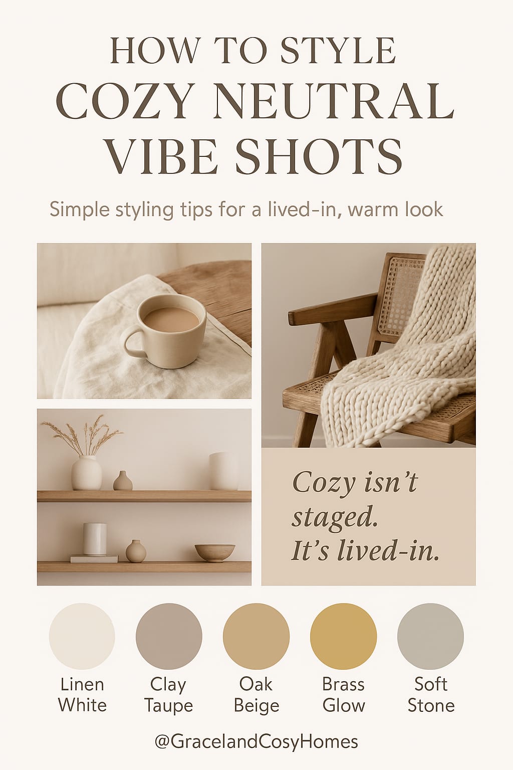
The Cozy Neutral Kitchen Color Palette
Discover our signature Cozy Neutral Kitchen Color Palette — a calming blend of soft linen whites, warm taupes, and antique brass tones. Perfect for creating a timeless, cozy space without overpowering color.
7/31/20251 min read
🎨 Introduction
Choosing the right color palette is the foundation of a beautiful, calming kitchen. At Graceland Cosy Homes, we believe in soft tones, warm undertones, and grounded shades that feel timeless — not trendy. In this post, discover our signature Cozy Neutral Kitchen Palette and how to bring it to life in your space.
---
🌿 The Cozy Neutral Kitchen Color Palette
Here’s the palette we love for cozy, natural kitchens:
Color Hex Code Mood
Soft Linen White #F8F6F2 Clean, airy base
Warm Oak Beige #D5C3AC Natural, grounded
Muted Taupe Grey #B6AA9F Calm, earthy balance
Creamy Clay #E4D7C2 Soft warmth
Antique Brass Accent #C3A679 Cozy contrast
Use this palette on walls, cabinets, shelving, or accessories like rugs, utensils, or hardware.
---
🖼️ How to Use This Palette
Cabinets → Soft Linen White or Muted Taupe
Shelves & Stools → Warm Oak or Creamy Clay
Accents → Antique Brass pulls, light fixtures, or frames
Textures → Pair with linen, rattan, or ceramic
---
💡 Why It Works
This palette blends warm and cool neutrals, avoiding a flat or sterile feel. It creates softness without being overly feminine and elegance without being cold.
Neutral, but never boring. Calm, but never plain.
---
📎 Downloadable Color Palette Graphic
📥 Coming Soon: Download our “Cozy Neutral Kitchen Palette” as a printable reference sheet or mobile guide.
Who We Are
With a passion for sustainable living and timeless design, we offer tips, products, and services that turn everyday spaces into havens of peace, beauty, and functionality.
How we earn
Hey there! Just so you know, Graceland Cosy Homes earns a small commission when you shop through links we share, like from Amazon or other affiliate programs. It doesn’t cost you anything extra and helps keep this site running we only recommend products we truly believe in. Thanks for your support!
© 2025. All rights reserved.